The '10% Usage' Paradox: When More Features Mean Less Productivity
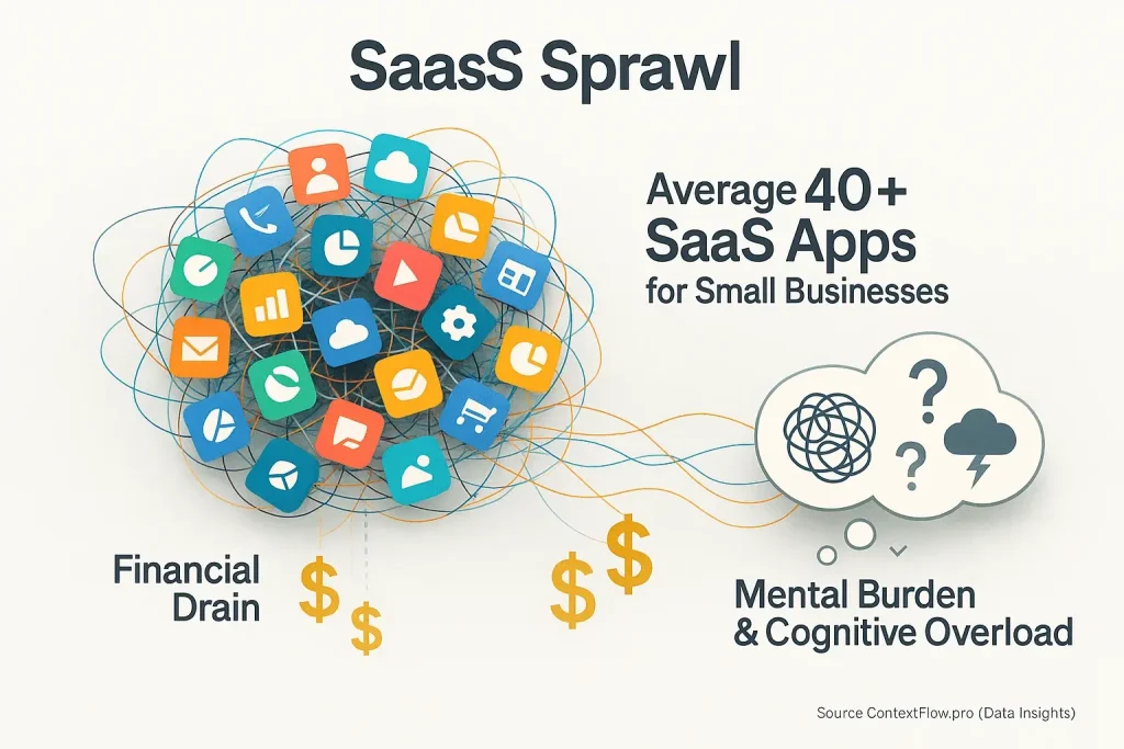
Ever download a new hybrid work tool? You then use just a tiny fraction of its features. More features initially appear beneficial. Many users, however, report a different experience. This complexity actively hinders their hybrid work productivity. It's a widespread paradox our analysis of user feedback uncovers.
This issue extends beyond unneeded options. The presence of unused features introduces cognitive cost. Many professionals feel overwhelmed. Bloated interfaces intimidate them. Consequently, they ignore most functionalities. This pattern, clear in user communities, highlights underutilization. It signals wasted potential.
This 'feature bloat' directly drains focus. It diminishes hybrid work efficiency. More tools often mean less effective work. A surprising truth. Our research into user-generated content consistently reveals this counter-intuitive drag on professionals.
The 'Digital Dust Collectors': Why Most Features Go Unused (User Insights)
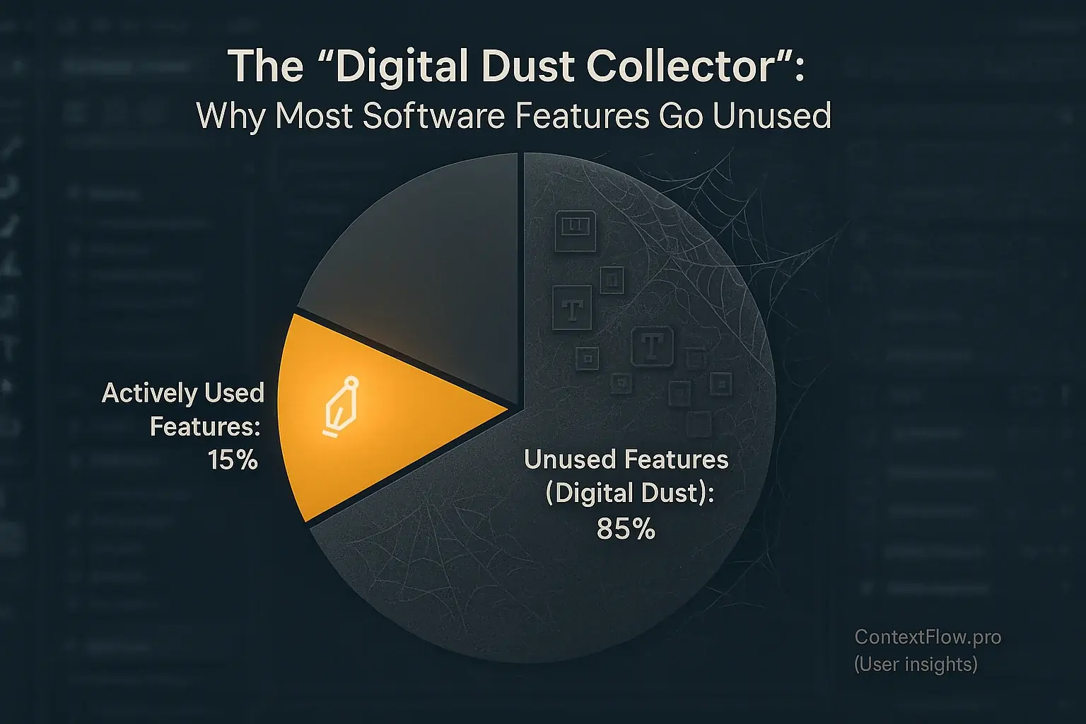
Many users interact with a surprisingly small fraction of a tool's total capabilities. It is like buying a complex multi-tool. You only ever use one attachment. This widespread underutilization is rarely about user laziness. Our research into user experiences reveals features frequently fail to align with established daily workflows. Sometimes, useful functions are just too buried within complex interfaces to discover.
These dormant functionalities become digital dust collectors. Users often describe how this feature overload creates significant mental clutter. Locating the actually needed tools turns into a frustrating hunt. Imagine a workspace. Your essential pen is lost among twenty untouched gadgets. This constant friction slows progress. It erodes overall efficiency, a common pain point echoed in countless user reports.
Vendor strategy often contributes to this feature bloat. An unspoken truth emerges from user feedback patterns. Companies frequently add functions for competitive parity. They chase niche user segments. The irony? A "killer feature" for one specialized team translates to mere digital noise for many others. This only deepens the problem of unused software components.
This overload pushes users toward a clear solution. They begin seeking simpler alternatives. Individuals and teams may technically "lose" access to some advanced functions. They gain something more valuable: clarity and focus. This trade-off, sacrificing feature quantity for streamlined usability, is an increasingly common choice observed in user behavior.
The 'Onboarding Tax': Hidden Costs of Steep Learning Curves in Complex Hybrid Tools
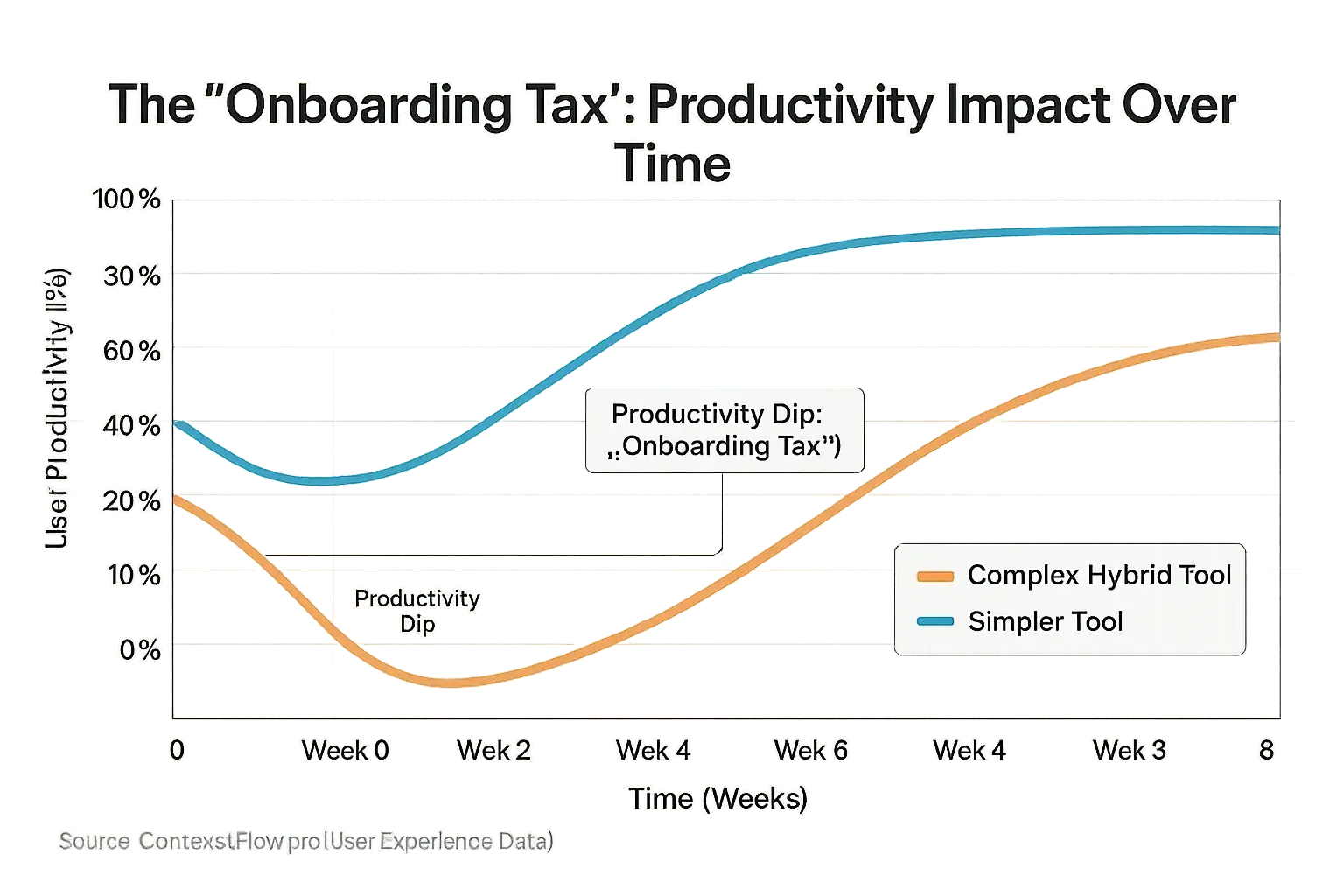
New tools often promise efficiency. Excitement builds. Then, the 'onboarding tax' hits. This hidden cost drains your time. It consumes your cognitive energy. That initial 'wow' factor often gives way to a frustrating 'how do I even start this?' moment. Learning complex software is not just a one-time setup. It becomes an ongoing investment, a continuous drain on precious focus.
Many users report significant productivity dips. This happens during early tool use. Sometimes for weeks. Even months. They describe feeling overwhelmed. Menus confuse. Settings baffle. Unfamiliar features create deep frustration. Task completion slows considerably. This is the unspoken truth of feature-rich tools. They demand a substantial cognitive investment from every user.
Hybrid work amplifies this 'tax'. Context switching is already a major challenge for many teams. Adding a steep learning curve to a new tool creates further problems. It can be a recipe for disaster. Our analysis of user experiences shows individuals often revert. They choose simpler, familiar methods. Some abandon the new tool completely. Its supposed benefits then vanish. The investment? Wasted.
Teams constantly adopting complex tools pay this onboarding tax repeatedly. Perpetual learning drains collective energy. Overall efficiency suffers significantly. The promise of progress remains elusive. True mastery becomes rare. This cycle hinders real workflow improvement, keeping teams in a state of constant, low-grade digital friction.
The 'Brain Tab Overload': How Excessive Features Fuel Cognitive Overload and Kill Focus
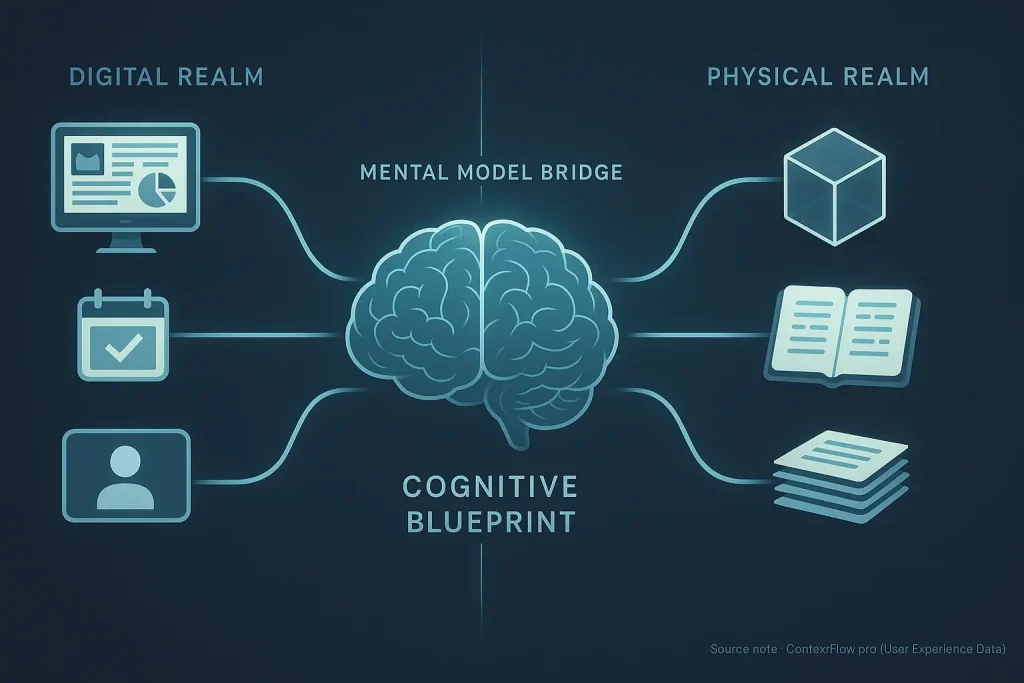
Ever feel your brain has too many tabs open? All demand instant attention. Complex hybrid work tools often create this exact scenario. This "brain tab overload" generates significant mental clutter. Countless features present users with a barrage of options, choices, and potential actions, draining precious cognitive energy before work even truly begins.
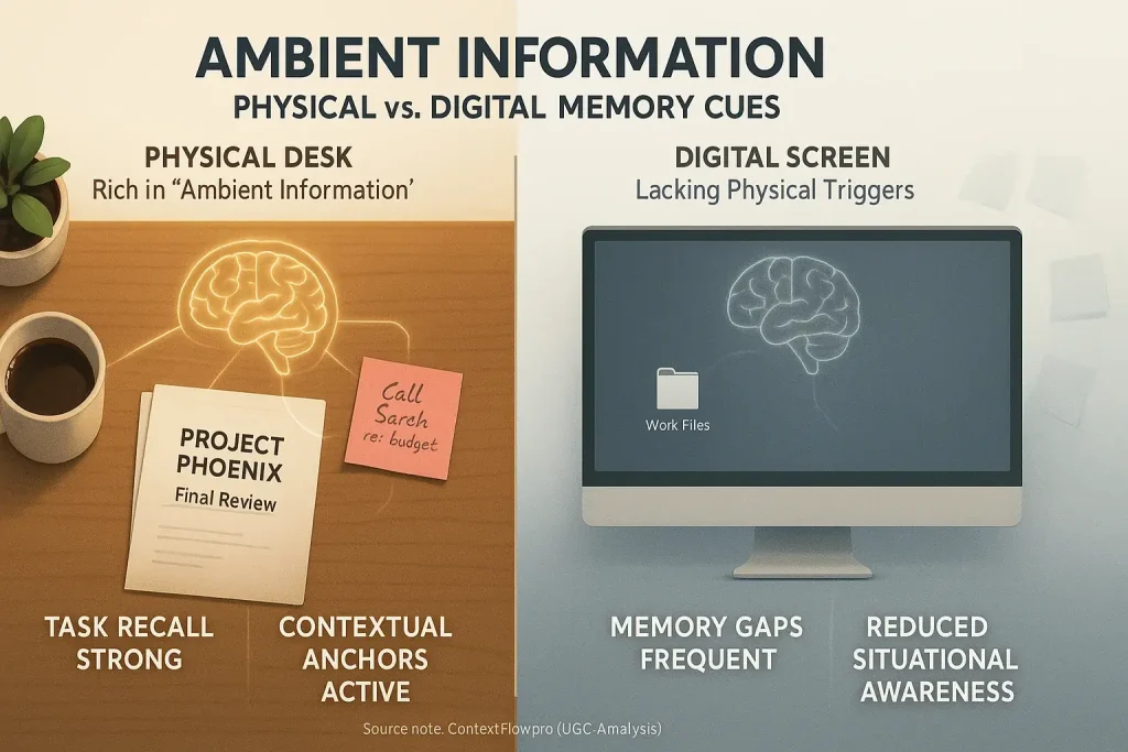
Users frequently describe a subtle, yet powerful, focus disruption. Even seeing unused features or overly complex menus pulls their attention. These visual elements become micro-distractions. This constant, low-level background processing actively prevents deep, concentrated work. It contributes significantly to that pervasive feeling of being overwhelmed. The unspoken truth? The mere presence of excessive options is a cognitive burden, a key finding from our analysis of user experiences.
This continuous cognitive strain inevitably leads to decision fatigue. Every click matters. Every interface choice, even unconsciously deciding not to use a visible feature, adds to the mental load. Such fatigue makes sustained focus on core tasks exceptionally difficult. What happens next? Users report increased procrastination or a noticeable dip in the quality of their output. This explains why simpler, more focused tools often receive higher praise for actual productivity boosts.
The 'Less is More' Revolution: Why Users Are Craving Simpler Tools (and Getting More Done)
Professionals endured feature overload for years. A powerful user shift now emerges. Many individuals declare: "Enough! Give us simplicity." This growing preference champions tools that perform one task exceptionally well. Bloat is out. Focused utility is in.
Our UGC analysis reveals a clear pattern. Users find a minimalist tool stack dramatically increases their focus. It significantly reduces cognitive load. Professionals describe a newfound clarity. Efficiency soars. They spend less time navigating complex interfaces. More time gets dedicated to actual work. Simplicity, many discover, is a productivity superpower.
This 'less is more' philosophy directly impacts hybrid work effectiveness. A simple, intuitive tool becomes a lifeline when professionals constantly switch contexts. Home to office. Office to home. Such tools reduce operational friction. They accelerate transitions between tasks and environments. Consistency across varied work settings improves substantially. Users report feeling more in control.
This revolution is not about demanding 'dumber' tools. Far from it. It champions intentional design. Smart simplicity prioritizes user workflow above all else. The collective user voice advocates for interfaces that eliminate unnecessary complexity. The goal? Maximum output with minimum cognitive strain. That's the new benchmark.
Your Tool Complexity Self-Audit: Is Feature Bloat Hiding in Your Hybrid Workflow?
Assess Your Tool Complexity Score
1. How often do you feel overwhelmed by the sheer number of features in your main work tools?
2. When a new feature is rolled out, how much time do you typically spend learning it?
3. Do you find yourself using less than 20% of your primary tool's advertised features?
4. Does navigating complex menus or settings make you lose your train of thought on your main task?
This self-audit identifies feature bloat within your hybrid workflow. Honest answers reveal hidden productivity drains.
Consider your audit results carefully. Simplifying your toolset can markedly improve context flow. Users report better focus. Greater efficiency often follows.
